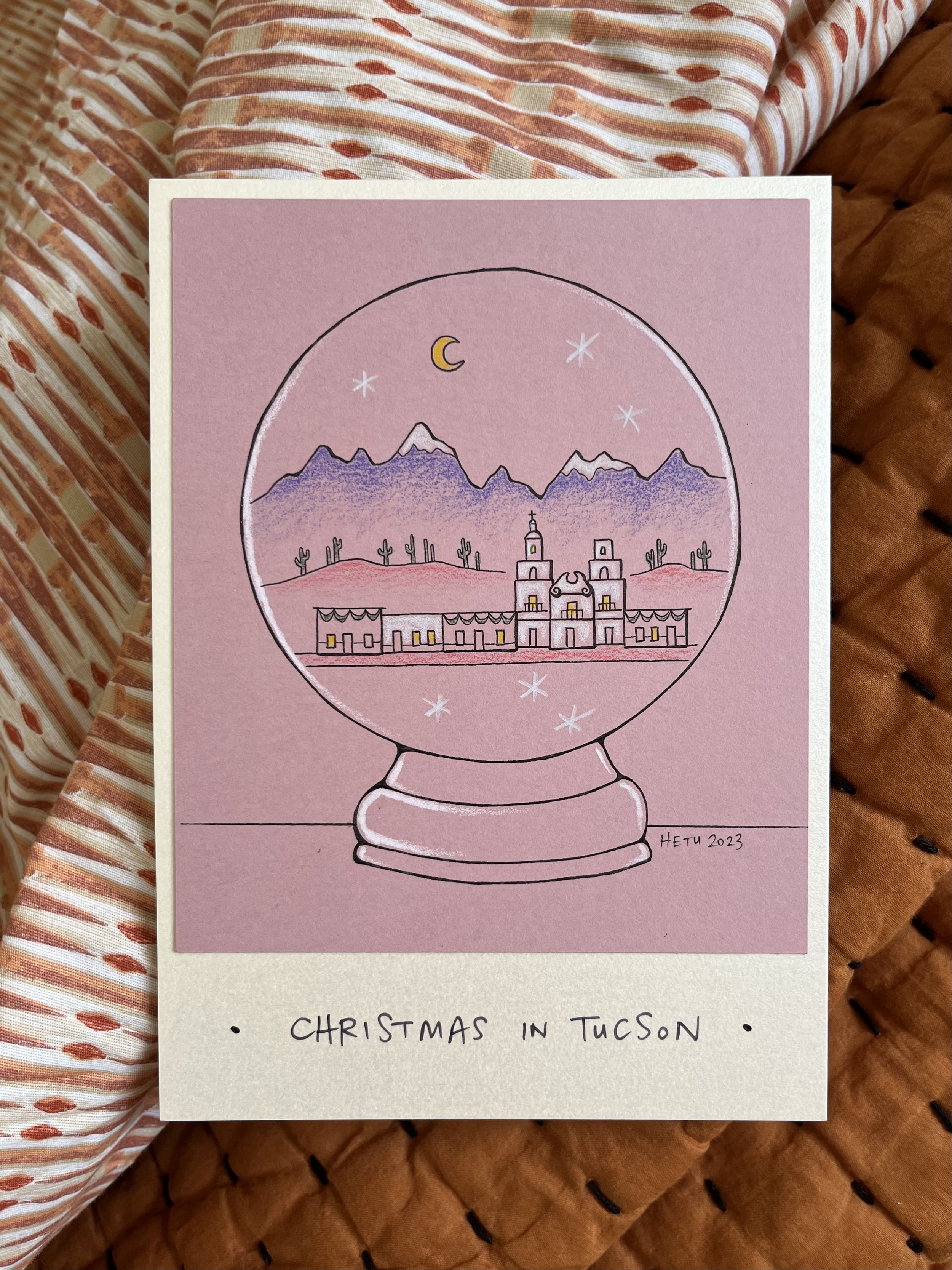
2023 was the year of pink for me. I noticed hues of pink - natural or unnatural - in my everyday life. The abundance of pink led me to purchase a pink iPhone and unsurprisingly, guided me to design pink Christmas cards. I chose the color long before I knew what to draw. But the colors, imagery and theme all fell into place perfectly. Love when that happens.
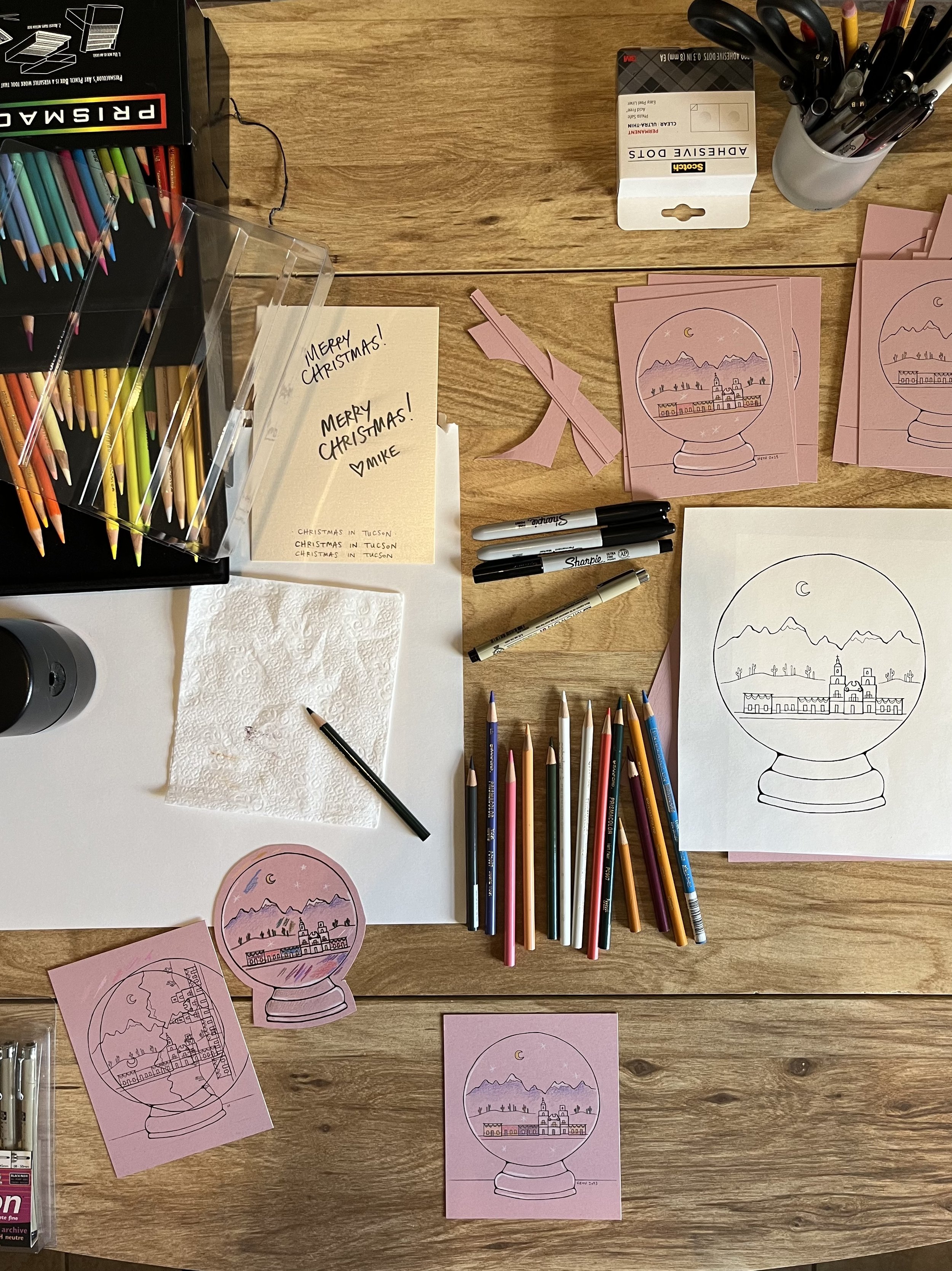
I wanted to make it easy for myself, so I decided I would draw one illustration, then photocopy the image onto card stock. I could color each card separately without needing to draw and ink the illustration over and over again. To thwart my usual procrastination, I ordered paper supplies from Paper Source in November with a goal to send out my Christmas cards December 1. Pffff! I didn’t start the illustration until December 9.
This year’s color palette - official names from Paper Source - is rose, opal and brown paper bag. Rose card stock for the printed illustration, iridescent opal flat cards for the backing and brown paper bag for the envelope. (If you received a different color envelope, it’s because I was using up past years’ envelopes. Sorry.)
For the illustration, I wanted to depict Arizona/the Southwest/Christmas, but wasn’t sure how to do it. I scrolled through photos on my laptop of my first visit to Tucson (before I decided to move here). I stopped on these images of San Xavier del Bac Mission and a home in Barrio Viejo:
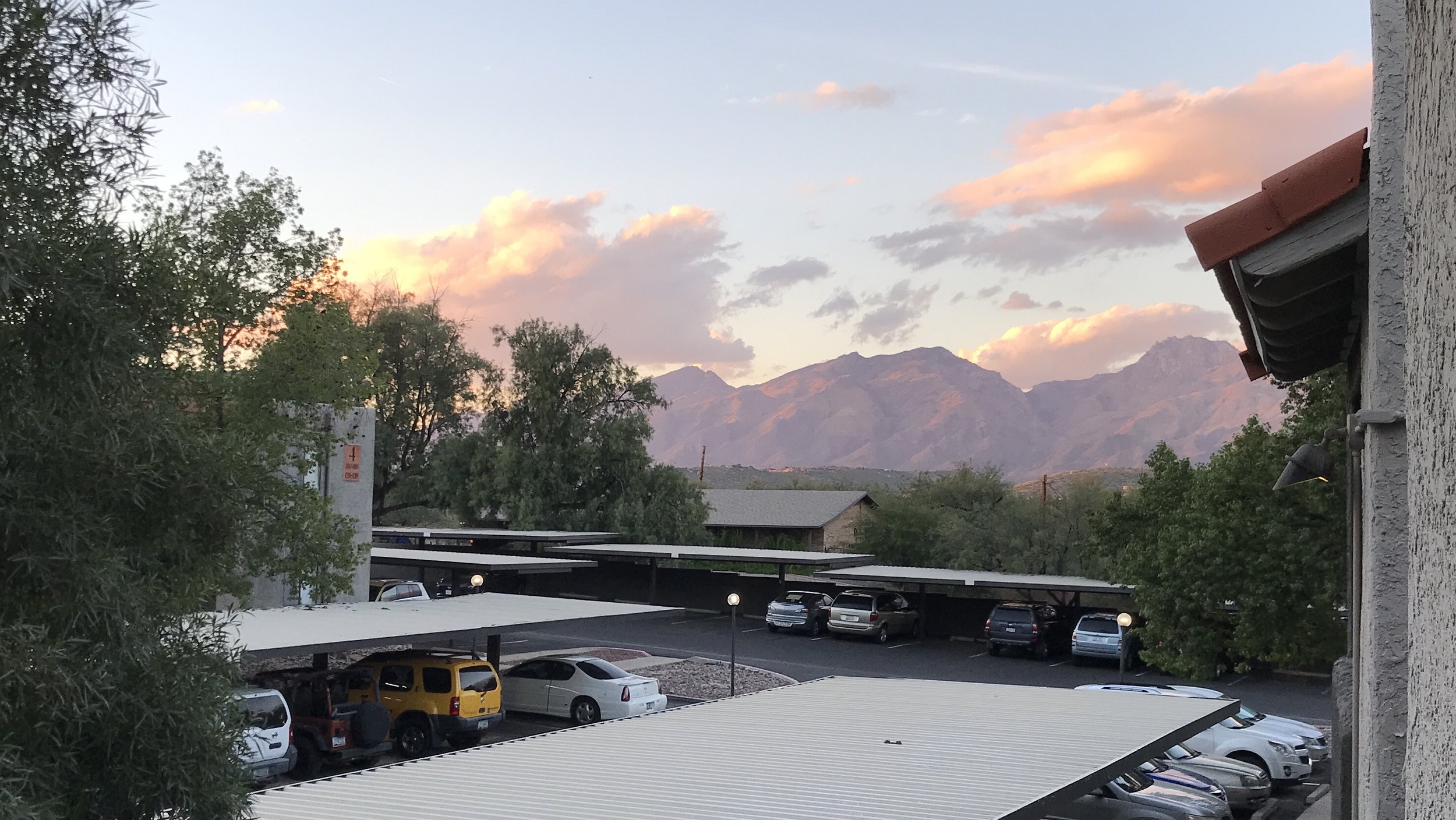
Sunset happy hour on my balcony has become an integral part of my days off. I knew I wanted to capture some aspect of that small window of time when the sky and mountains are pink and purple. But this was a Christmas card, so I had to reference the rare snow-topped mountains too.
Now how to wrap all these elements into a contained landscape with a Christmas reference? Where does it always snow even if the climate is warm? Inside a snow globe.
Here’s my workspace. The larger snow globe drawing on white was the original illustration. I scaled it down.


